Tuesday, May 29, 2012
Picking Granite for Your Kitchen Remodel
Monday, May 28, 2012
Other Side of the Door
What to hand on the other side of the door. We have an entry chandelier decision to replace. The former light was very large, brass with many lights. One problem in choosing the right light for this entry is the ceiling height. We have ten feet but must keep at least seven feet of clearance below the light. This is limiting the selection because many lights are two to three feet in height to start with. A local light shop helps with the decision by photo shopping various fixtures into your own photo. They help make the choice selection a little bit easier.
Friday, February 04, 2011
Architectural Digest--New Editor/Updated?
Anyone who is planning or is in the middle of a remodel knows that the glossy shelter magazine is a very important cost effective advisor. Now one of the staples of the industry has a new editor-in-chief at the helm, Margaret Russell. Ms. Russell states "AD will always be the place to find the ideas, talent, and sources to make your dreams come to fruition."
The New York Times has featured an article about the transition of AD. As a new subscriber to AD, (first magazine arrived this week), I look forward to watching the magazine over the next week.
The New York Times has featured an article about the transition of AD. As a new subscriber to AD, (first magazine arrived this week), I look forward to watching the magazine over the next week.
Labels:
AD,
Architectural Digest,
Margaret Russell,
shelter magazine
Entry Door (Mahogany Panel) Before and After
 |
| Original door with stone facade. |
 |
| Stone facade was replace by stucco finish. Glass choice provides privacy while still allow light in the entry hall. |
 |
| Mortise lock. Allows free exit with choice of lock/no lock depending on the position of the bottom toggle. |
Thursday, February 03, 2011
Secondary Bath Before and After--More Details
 |
| Vanity--Back splash in same material as counter top. |
 |
| Light Fixture Centered over Mirror in Polished Nickel |
 |
| "Egg" style hardware with back plate in oil rubbed bronze |
 |
| Two matching towel bars. Towels from Restoration Hardware. |
 |
| Detail of Harlequin Tile on Wall surrounding Tub |
 |
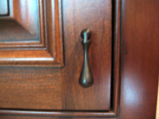
| For interest, oil rub bronze drop hardware |
 |
| California Title 24 Energy Saving Switches. Motion sensor for automatic turn off. Fan is on left hand side with ability to preset run time with automatic turn off. |
 |
| Subway tile on walls and continues up around the arch. |
 |
| Light in Shower/Tub |
Labels:
Bath tile,
cabinet hardware,
light fixture,
Title 24
Wednesday, February 02, 2011
Secondary Bath Before and After
After view of subway tile bath surround with shampoo niche.

View of arched bath surround with complementary glass doors and vanity with mirror.


View of arched bath surround with complementary glass doors and vanity with mirror.

Before photo shows the boxy lack of style.
The secondary bath had quite a dramatic improvement from the "before" design. The rooom was quite boxy with little architectural detail. The tub was offset which allowed for an awkward "seating" platform. This was never used for seating, but was a catchall for various bathing/shampoo products. The framing for the glass doors intersected the window.
During the remodel, we framed the tub in symmetrically to the window and added an arch with overhead light. The light is on a dimmer allowing for bright or dim lighting. To keep the room bright, we selected white tile for the tub surround and set it in a subway pattern. The pattern continues up the wall and through the arch. The arched area outside the tub was tiled in a harlequin multi-colored stone pattern. We used this same tile to line the shampoo/soap niche which ties the two together. The floor is tiled in crema marfil and a marble slab which complements the tiles was selected.
The tub, sink, and toilet are white. Walls are painted gourmet honey. Fixtures are in polished nickel and the glass doors are arched to match the surround. The vanity is alder stained in a midtone brown with matching beveled mirror. Over the mirror is a three light fixture in polished nickel.
Labels:
bath remodel,
before and after photos of bath,
tile
Wednesday, November 24, 2010
Tuesday, November 23, 2010
Subscribe to:
Comments (Atom)


